(1)_edited.png)

Design portfolio · 2026
I design to sell,
not to please myself.
Graphic designer and art director. Visual identity, presentations, brochures, and campaign materials—delivered within brand guidelines and under tight deadlines. Fourteen years of experience across Brazil, Egypt, and Europe, with an economics background informing every decision.
BASE Krimpen aan de Lek, NL · CET time zone
FORMAT Company · 100% remote · flexible shifts
CONTACT info@wodson.co
PHONE +31 6 3569 5889
3
continents
14
years
214
clients
2
diplomas
01. Introductions
True layout design:
grid, hierarchy and details.
A slide is not a poster. Reading is linear, typography must hold up across projectors and PDFs, and the client will reopen the file to edit it. Each case below shows the before, the after, and the decision behind it.

02. Visual Identity
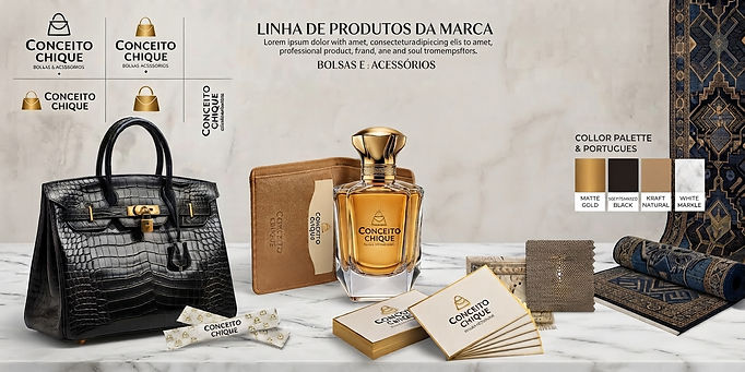
Branding as a system, not as a standalone logo.
Branding
Positioning, brand, color palette, typography, and application.
Clients from around the world—the Netherlands, Brazil, Egypt, the United States, and more.
.png)


03. Graphic assets
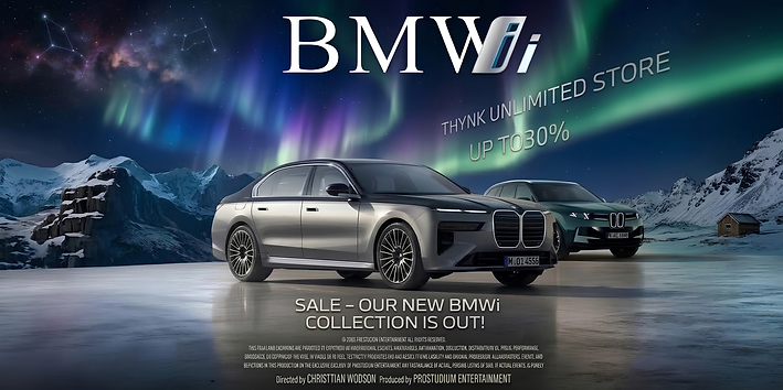
Brochure, event, campaign
The dates were modified so as not to compromise the original content of the campaigns.



04. Art direction and film
Where the visual repertoire was built
Directing, cinematography, and editing since 2012—in Brazil, Egypt, and Europe.
Color, framing, and rhythm come from graphic design—that is where my sense of hierarchy originates.



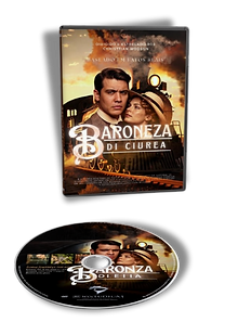
Baroneza di Ciurea
Feature film screenplay, 204 pages, with registered rights.
Original work
05. How I work
Three things you can count on me for
01
The brief is a business problem.
I have a background in economics and four years of experience as a marketing director. I advocate for visual choices based on business arguments—logic and numbers—rather than personal taste.
02
The manual belongs to the client, not me.
I work within an existing identity without trying to rewrite it. When the brand is my responsibility, that is when I make proposals.
03
Time zone favoring the deadline
I work from the Netherlands. The early hours in Brazil mark the start of my day: whatever comes in at the end of your day is ready to go by the start of the next one.
06. Ease and speed
You don’t need to worry about the paperwork. I draft the full contract—clearly outlining the scope, timelines, deliverables, rights assignment clauses, and all terms and conditions. You simply review it, ask any questions you might have, and sign. I handle all the heavy lifting.
Two rounds of revisions are included at no extra cost, ensuring the final artwork turns out exactly as you envisioned.
Upon completion, all usage rights for the created material are transferred to you, as formalized in the contract. And, if it makes sense for your business, I can guide you through registering your trademark with the INPI—and, if you have plans to expand beyond Brazil, through international registration as well. That way, your brand is truly protected, both at home and abroad.
And that’s just the beginning. Whenever you’re ready, we can sit down and map out possibilities for expanding your brand—exploring new markets, channels, and audiences.
07. Availability
SHIFTS Early morning, weekends, and part-time business hours
EMPLOYMENT Contractor (B2B) WORLDWIDE — I hold a CNPJ (Brazil) and KVK (Netherlands)
MEETINGS 10:00 AM – 3:00 PM (Brasília time)
LANGUAGES Portuguese, English, Dutch, and Spanish
08. Case studies
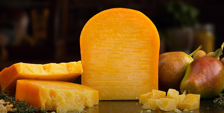
[CASE — GOUDA CHEESE]
1. THE BRIEFING
Client: MS Artisanal Cheese Shop
Product: Gouda Cheese
Format: Instagram — 1080 × 1350 px
Objective: To transform a simple product photograph into a premium advertisement.
Client request:
“We need an ad for our Gouda that looks artisanal, sophisticated, and appetizing. We want people to see the image and feel an urge to try the cheese.”
The issue was that while the product itself was excellent, the photograph provided failed to convey its true value.
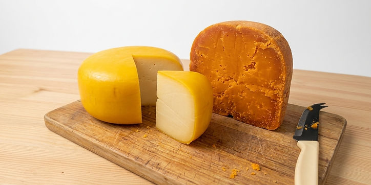
2. BEFORE — raw material
The original photo featured:
ordinary lighting;
a neutral background;
low contrast;
a composition lacking depth;
cheese that looked technically correct but unappetizing;
no culinary context;
no advertising hierarchy.
The initial decision was not merely to “beautify” the photograph, but to transform it into a piece of visual communication.
3. EDITING PROCESS
Step 01 — Technical correction
Adjustments to exposure, temperature, contrast, sharpness, and color balance.
Step 02 — Setting the scene
A more sophisticated culinary environment was created, incorporating wood, fabric, fruit, and natural elements to convey an artisanal feel.
Step 03 — Gouda treatment
The cheese underwent careful treatment to preserve its authentic appearance while highlighting:
texture;
golden hue;
cut surfaces;
volume;
natural sheen.
Step 04 — Lighting
The lighting was rebuilt to create a professional food photography look, drawing the viewer's eye to the product.
Step 05 — Art direction
The following elements were defined:
background; product positioning;
breathing space (white space);
color palette;
typography;
visual hierarchy.
Step 06 — Copy
The piece featured the headline:
“TRADITIONAL FLAVOR IN EVERY SLICE”
along with secondary messaging highlighting its artisanal and premium nature.
4. AFTER — final piece
The result moves beyond looking like a simple photo of cheese and begins to function as a cheese advertisement.
The composition was designed so that, within a few seconds, the consumer perceives:
PRODUCT → QUALITY → ARTISANAL → DESIRE → PURCHASE
5. PRODUCTION TIME
Step Time
Briefing analysis 20 min
Photo selection and preparation 25 min
Photo editing/retouching 40 min
Scene composition 30 min
Art direction 20 min
Typography and copy 20 min
Final adjustments 15 min
Total ≈ 2h50
Total time presented to the client: approximately 3 hours, including a brief round of adjustments.
6. CLIENT DELIVERY
The following were delivered:
Main artwork for Instagram;
Version for Stories;
High-resolution file;
Text-free version for future campaigns;
Editable file;
Adaptation for WhatsApp.
The logic behind this case study is to demonstrate that the work involved more than just “editing a photo.”
It was a process combining art direction, food photography, image editing, advertising, and graphic design.
VISUAL RESULT
[CASE — PRECISION LIPSTICK]
1. THE BRIEFING
Client: Lumière Beauty
Product: Liquid lipstick with a precision applicator
Format: Instagram campaign — 1080 × 1350 px
Objective: To showcase the product's unique selling point in a visual, sophisticated, and commercial way.
The client reached out with a very specific need:
“We don’t just want to make a lipstick ad. We need to show why this product is different.”
The product features a pen-style applicator with a fine, brush-like tip, allowing for precise lip outlining and filling.
The challenge was to transform this technical feature into consumer desire.
Campaign objectives:
Clearly show the applicator.
Highlight application precision.
Show the product in use.
Showcase the finish on the lips.
Create a premium product perception.
Help the consumer quickly understand what sets this lipstick apart from conventional ones.
2. BEFORE — PHOTO RECEIVED FROM THE CLIENT
The client sent a simple photograph of the product.
The product was well-photographed, but there were some issues:
Neutral background;
Lack of dramatic lighting;
Shallow depth;
Product appeared small within the composition;
No demonstration of application;
The applicator's unique feature was practically invisible;
The photo looked more like a catalog shot than an advertising campaign image.
Diagnosis:
The product didn't necessarily need a new photograph.
It needed a new visual presentation.
3. CREATIVE CONCEPT
The chosen idea was:
“THE LIPSTICK WITH A MAKEUP ARTIST'S PRECISION.”
Instead of just showing the packaging, the campaign needed to show the product in action. The visual direction was built around three elements:
PRECISION + BEAUTY + CONTROL
The fine tip was meant to take center stage.
4. EDITING PROCESS
STEP 01 — Product retouching
First, the original photograph was corrected:
Exposure;
Contrast;
White balance;
Sharpness;
Reflections;
Minor imperfections;
Packaging definition.
Approximate time: 25 minutes.
STEP 02 — Art direction setup
A sophisticated environment was developed to showcase the product.
The chosen palette featured:
Black;
Champagne;
Rose gold;
Skin tones;
The lipstick's red/pink hue.
The goal was to create a premium cosmetics campaign aesthetic, rather than a simple product ad.
Approximate time: 30 minutes.
STEP 03 — Lip close-up
This was the most critical part.
An extreme close-up shot of the lips was created, showing the applicator tip working along the lip contour.
The visual communication needed to answer this question immediately:
“What does this applicator do?”
The consumer needed to visualize the difference without having to read an explanatory paragraph.
Approximate time: 35 minutes.
STEP 04 — Skin and product retouching
Photographic retouching was applied while preserving natural texture.
The intention was not to create artificially perfect skin.
The following elements were preserved:
Pores;
Small natural variations;
Lip texture;
Realistic sheen;
Pigment finish.
This is particularly important in makeup advertising, as an overly artificial image can make the product appear fake.
Approximate time: 30 minutes. STEP 05 — Typography and communication
After the photography, the advertising aspect came into play.
Headline:
PRECISION THAT ENHANCES YOUR BEAUTY
Subheadline:
Pen-style applicator for precise, smudge-free lining.
And three attributes were highlighted:
PRECISION
HIGH PIGMENTATION
FLAWLESS FINISH
5. BEFORE × AFTER
BEFORE
A standard product shot.
The consumer sees:
“A lipstick.”
AFTER
A visual campaign.
The consumer understands:
“It’s a unique lipstick because I can control exactly where I apply it.”
This is the project's key transformation.
It wasn't just an aesthetic improvement of the photograph.
It was a transformation from product → concept → desire → commercial communication.
6. TOTAL TIME
Stage Time
Briefing and analysis 20 min
Photo retouching 25 min
Art direction 30 min
Close-up composition 35 min
Skin/lip retouching 30 min
Design and typography 20 min
Instagram mockup 15 min
Final adjustments 15 min
TOTAL ≈ 3h10
With one round of revisions requested by the client, the project would wrap up in approximately 3 hours and 30 minutes of work.
7. FINAL DELIVERY
The package delivered to the client included:
1 main artwork (1080 × 1350)
1 Stories version (1080 × 1920)
1 square version
Retouched product photography;
Close-up of the lips;
Text-free version;
Editable file;
WhatsApp adaptation;
Mockup for client presentation.
8. CASE STUDY OUTCOME
The work transformed a simple photograph into a campaign that visually explains the product's key advantage.
The final piece doesn't rely solely on a phrase stating that the applicator is precise.
It shows that precision in action.
Final concept:
“More than a lipstick. The precision of a brush at your fingertips.”
VISUAL RESULT


[CASE — WIRELESS HEADSET AURAL FURY]
1. THE BRIEFING
Launch campaign / Art direction for a premium headset
Client: Aural Fury
Product: High-performance headset
Campaign: AURAL FURY — DISRUPTING THE VOID
Main format: Horizontal Key Visual — 2048 × 1024 px
Segment: Audio / Gaming / Music / Technology / Lifestyle
Visual direction: Futuristic, aggressive, high-tech, and premium
Aural Fury approached the creative team to develop a visual campaign for its new headset.
The product needed to be presented as something more than just a piece of audio equipment.
The brand wanted to convey the feeling that:
“When you put on the headset, you enter another universe.”
The main challenge was creating a visual identity that connected sound, technology, energy, and attitude, without falling into the generic aesthetic of typical headset advertising.
Client request:
“We want a campaign that feels technological, but not like an ordinary tech ad. The headset needs to convey power, immersion, and personality. We want something that feels like an experience.”
2. CAMPAIGN OBJECTIVES
The project had five main objectives:
01 — Elevate the headset
The product needed to look like premium, technologically advanced equipment.
02 — Create an identity
The campaign needed to be recognizable without relying solely on the logo.
03 — Communicate IMMERSION
The person wearing the headset needed to appear completely connected to the audio.
04 — Link audio to visual energy
Sound needed to be represented through abstract graphic elements.
05 — Create a campaign image
Not just a product shot, but a Key Visual capable of anchoring an entire campaign.
3. CREATIVE CONCEPT
“DISRUPTING THE VOID”
The concept stems from the idea that silence is an empty space.
The headset disrupts that space. Therefore, the art direction employs a combination of:
SHATTERED GLASS + CRYSTALS + SOUND WAVES + DIGITAL CODE + CIRCUITS
These elements represent different dimensions of the sound experience.
Shattered glass
Represents a break from the conventional.
Crystals
Represent frequency, light, refraction, and technology.
Fluid waves
Represent sound propagating through space.
Binary code
Represents the connection between music and technology.
Circuits
Represent hardware and technological precision.
4. BEFORE — ORIGINAL MATERIAL
The original photograph featured the model wearing the headset in an extremely dark setting.
The photograph had one key strength: the face and the product already commanded attention.
However, on its own, the image primarily communicated:
“A person wearing a headset.”
For a launch campaign, this was insufficient.
It lacked:
Context;
Visual universe;
Brand identity;
A sense of movement;
Representation of audio;
Technological elements;
Narrative.
The creative work began precisely with this photograph.
5. CREATIVE DIAGNOSIS
The team determined that there was no need to hide the original photograph.
Instead, a universe needed to be built around it.
The model would remain the human focal point of the campaign.
The rest of the composition would represent what she is hearing.
This led to the following logic:
REAL PHOTOGRAPH
↓
SOUND EXPERIENCE
↓
DIGITAL UNIVERSE
↓
AURAL FURY IDENTITY
6. ETAPA 01 — TRATAMENTO DA FOTOGRAFIA
The original photograph was first processed to establish a cinematic foundation.
Adjustments were made to:
Exposure;
Contrast;
Temperature;
Shadows;
Highlights;
Definition;
Skin;
Hair;
Headset;
Character cutout.
The goal was to preserve the photographic look and avoid making the model appear artificial.
Estimated time: 35 minutes
7. STAGE 02 — WORLD-BUILDING
After the main photograph was processed, the visual environment was created.
The composition was given a large geometric crystal structure in shades of: electric blue + violet + indigo + black.
The choice of these colors was strategic:
Blue conveys technology and audio.
Violet adds a futuristic dimension.
Black creates depth and sophistication.
8. STAGE 03 — SHATTERED GLASS
Cracked glass/crystal fragments were added.
The intention was not merely decorative.
They represent the concept:
“Disrupting the Void.”
The character is literally at the center of a reality that appears to be shattering under the force of sound.
Estimated time: 35 minutes
9. STAGE 04 — SOUND WAVE
This is one of the campaign's key elements.
A large, fluid structure cuts horizontally across the composition.
It serves as a visual representation of the music.
Instead of a traditional sound wave, an organic, almost liquid form was chosen.
This gives the audio the appearance of having mass, movement, and energy.
The wave also creates a visual connection between the two sides of the composition.
Estimated time: 45 minutes
10. STAGE 05 — TECH AESTHETIC
To reinforce the technological identity, the following were added:
Circuits;
Geometric lines;
HUD elements;
Binary code; Small indicators;
Technical frames;
Futuristic interface elements.
However, these elements were kept secondary.
The intention was to avoid turning the piece into a screen cluttered with elements.
The hierarchy had to remain:
FACE → HEADSET → WAVE → UNIVERSE → BRAND
11. STAGE 06 — VISUAL IDENTITY
The brand received a specific treatment for the campaign.
The title—AURAL FURY—was placed at the bottom of the composition, creating a strong signature.
Directly below, "DISRUPTING THE VOID" serves as the campaign slogan.
The typographic treatment employs a futuristic, geometric, and high-tech aesthetic.
12. BEFORE × AFTER
BEFORE
A photograph of a woman wearing a headset.
The main message was:
“Person using the product.”
AFTER
A complete visual campaign.
The message shifts to:
“A sound experience capable of breaking through reality.”
This is the project's key transformation.
13. ART DIRECTION
The visual direction was crafted to feel like a blend of: a tech campaign, an electronic album cover, premium audio advertising, and a cyberpunk universe.
Yet, it avoids turning the piece into purely "gamer" art.
The goal is to position Aural Fury as a brand that can speak simultaneously to:
Gamers;
Music producers;
DJs;
Music consumers;
Content creators;
Tech enthusiasts;
Premium audio users.
14. COLOR PALETTE
PRIMARY
Deep Black
Depth and sophistication.
Electric Blue
Technology, audio, and energy.
Ultraviolet
Futurism and identity.
Indigo
Visual depth.
ACCENT
White / Silver
Contrast and technological elements.
15. REALISTIC PRODUCTION TIMELINE
Stage Time
Briefing and analysis 25 min
Photo retouching 35 min
Character cutout and integration 30 min
Crystal construction 40 min
Glass and cracks 35 min
Sound wave creation 45 min
Technological elements 30 min
Composition and lighting 35 min
Typography and branding 20 min
Color grading 20 min
Final adjustments 25 min
TOTAL ≈ 6h00
Allowing for one round of client revisions, a commercially plausible timeframe would be 6 to 7 hours of production.
16. DELIVERABLES
The project could generate a complete campaign package:
KEY VISUAL
2048 × 1024
SOCIAL MEDIA
1080 × 1350
STORIES / REELS
1080 × 1920
YOUTUBE
Thumbnail + banner
E-COMMERCE
Main product image
DISPLAY ADS
Horizontal and vertical formats
PRESS KIT
High-resolution version
BRAND ASSETS
Separate campaign elements for future assets.
17. POTENTIAL CAMPAIGN EXTENSION
The interesting thing about this concept is that it doesn't end with just this image.
The same visual language could spawn an entire campaign:
“HEAR THE IMPACT”
Close-up of the headset.
“BREAK THE SILENCE”
Shattering crystals.
“FEEL EVERY FREQUENCY”
Sound waves enveloping the character.
“ENTER THE VOID”
A darker, minimalist look.
“DISRUPT THE VOID”
Main key visual.
In this way, a single art direction evolves into a campaign visual system, rather than remaining just an isolated piece.
18. PORTFOLIO PRESENTATION TEXT
Aural Fury — Disrupting the Void
The challenge was to transform a product photograph into a visual experience capable of representing something that cannot normally be photographed: sound.
Starting from the original photograph, we developed an art direction based on crystals, shattered glass, fluid waves, digital code, and technological elements.
The goal was to create a visual language that conveyed power, immersion, and disruption, positioning the headset not merely as a piece of equipment, but as a gateway to a new sonic experience.
From silence to frequency. From photograph to experience.
CASE CLOSING STATEMENT
WE DIDN'T JUST SHOW THE HEADSET.
WE VISUALIZED THE SOUND.
AURAL FURY — DISRUPTING THE VOID
VISUAL RESULT

